Toyota reveals clean new 2D logo and visual identity for Europe
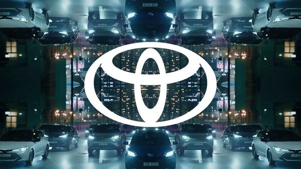

Toyota Motor in Europe has revealed a new visual identity of the brand with a reworked version of the logo and typography.This new design supports Toyota in its transition from a car manufacturer to a mobility company.Designed for an increasingly diverse clientele turning to the brand for its growing range of mobility products and services, this new language adapts to all digital and physical touch points.
The new visual identity is intended to be simple and has been shaped around four key principles: avant-garde, accessible on mobile, more premium look and feel and consistency between all the variations of the brand.
Also check these Vehicles
The new Toyota brand logo features its emblem in a simple 2D design, making the Toyota logotype disappear, as the emblem itself is now recognisable across Europe.This design translates simplicity, transparency and modernity, and adapts perfectly to both physical and digital worlds.The new logo will be used on all communication channels, while the current logo will still be present on vehicles.Current dealership signage will remain in place and will be reviewed in the context of the Toyota 2025 network strategy.
The new visual identity is accompanied by a new custom typography, Toyota Type, the use of which is just as relevant on physical as digital media, while delivering the customer the clearest possible message.This visual identity marks a new stage in the digital transition as the company continues to develop its online sales system in Europe.
Also Read : How coronavirus social distancing message made its way into carmakers’ logos
"We have developed this new visual identity with tomorrow in mind.Our goal was to contribute to a better customer experience, allowing them to follow Toyota's developments in terms of electrified vehicles, mobility services and online sales.The design has been redesigned in order to have better communication with our customers, and this through the different points of contact, they will discover for the first time with the launch of the new Yaris Hybrid, the 4thgeneration of our city car."said Didier Gambart, Vice-President, Sales, Marketing and Customer Experience, Toyota Motor Europe.
ToyotaMotor Europe has joined numerous other car brands by opting for aflat redesignof itslogowith a revisedvisual identity. Recently, BMW introduced a new logo with the centre black ring replaced with a transparent ring while the company's initials have been slimmed down. Volkswagen too has recently introduced its new logo in Vento, recently unveiled in Russia. Nissanalso followed in the footsteps of Volkswagen and BMW with the introduction of anew, two-dimensional and minimalistlogo.


 2487 cc
 Petrol
 72.8 kWh
 405 Km